Hello.
I've hardly been around.
Age 33, Male
Student
Location not disclosed
Joined on 12/29/06
- Level:
- 27
- Exp Points:
- 8,080 / 8,090
- Exp Rank:
- 5,341
- Vote Power:
- 6.91 votes
- Rank:
- Private
- Global Rank:
- 3,001
- Blams:
- 490
- Saves:
- 2,490
- B/P Bonus:
- 18%
- Whistle:
- Gold
- Trophies:
- 3
- Medals:
- 184
- Supporter:
- 11m 30d
- Gear:
- 1
Dosensuppen's News
Posted by Dosensuppen - September 18th, 2017
Really needs to go upwards. Like, it's at the VERY bottom of the page.
I was like, "You know, I remember when the home page displayed some of the portal submissions on the home page..." I went to 2011 on wayback machine and looked, yeah, it was there. I was then like, "Why did they get rid of it?" Scrolled down, and eventually saw it. It's still there, just at the very, very bottom.
Tom, dude, I know you want to promote good content, I feel ya, but you're practically hiding new submissions. Portal submits on the homepage is at the bottom, the games and movies category for Under Judgement is second the bottom of those pages on a top down navigation at the left, and the Classic Portal is the fifth button on the mavbar, and I don't know if anybody but Newgrounds vets are gonna know what a portal is.
Tommy, my man, the UJ phase is so hidden.
Posted by Dosensuppen - September 16th, 2017
Jedi-Master/Light.
I miss that dude. He was cool.
Actually, there's a lot of dudes and dudettes I used to talk to and made friends with when I was a regular on the BBS 2010-late 2012. I don't think too many of them are here anymore.
Guess it happens when I step away for three years. Five years of not posting to the BBS regularly.
Fuck.
Posted by Dosensuppen - September 12th, 2017
Before you continue:
Prioriziation is diffcult and these features will not likely come out in the near feature. It could be years before they are.
Tom 'n friends have a lot of other projects that they're trying to get finalized on the ol' NG, and the future features he suggested are't vital to Newgrounds success, but "nice to have," so they're likely to be shoved to the side until things are stable, which is a long battle with a lot of twists and turns on the current net.
Now, onto the the story. About an hour ago, I contacted the Fulp-Man about a feature that I, personally, would like to see: redesign-styled skins. Newgrounds has a long history and if you ever been to way-back machine and looked up Newgrounds, you'll see that.
Particularly, 98, 2001, 2003, a weird partial redesign in 04, 07 and the 12 design -- which is current albeit with some alterations.
Of course, you can't 1:1 a redesign: Newgrounds has evolved. Try comparing 03 to current, the differences are pretty vast.

Now, this, of coures, would mean that it would have to be a hybrid, of sorts. Tom mentoned that idea a long time ago in a thread. I don't recall it ever happening, even on April 1st. It's been a while, though. Apparently not, but some people really seemed to like the idea, according to Tom.
Here's exactly what I messaged Tom:
Hey, Tom.
So, I'm a nostalgic person time and again, I sometimes like to browse the themes of the old school days. Waybach Archives pretty cool for that. You know more than anyone else how much Newgrounds has changed being its creator. I don't need to tell you each design carries a new feeling.
Newgrounds has a long history, it was a pioneer of user submitted content. While it faces many struggles, it stands as a testament to independence. To help it, I think one feature that can feed to nostalgia and a variety of taste could be in order. Do you remember this thread from several years back? You posted how you had some people who appeared to be interested in an old school-new school hybrid. I've been on and off for a few years, I notice some differences since the 12 redesign, more gray which is a bit closer to the 07 design, but it still feels quite different.
If it were possible, I'd love to for supporters (and will definitely act as personal incentive for me) to have designs that hybrids the current with a past designs. I say hybrid, because with all the new features, there's no way you can go 1:1.
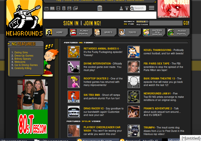
The 01 Design -- very simplistic yet clean. Linking late 2003 a bit before Stamper's 03 redesign due to it being slightly more full of content, though I do love the the frontpage flash from 01. What can I say? I'm a sucker for Endless Handbag.
The 03 Design -- The 03 design was very stylish and had a lot going on. I feel the 03 design, original, might fit a bit better as a hybrid than the one from later dates, like 05, due to the positioning of the menus and some other aesthetics. Although, damn if it isn't pretty. Maybe a hybrid 03-04-12 design? I dunno.
The 07 design -- most recent, short of the 12 design in recent memory. Sleek but perhaps not as stylish as the 03 design, it holds a newer nostalgia in my heart, while I came along around 03 and made an account in 06 (05, actually, in an older dead account) this design featured my biggest activity.
Allowing these choices as "skins" would be the best way to go about it and it's not like we need it to mimic perfectly, just enough to get the feeling of old school. And older school. And even older school. Probably not NGA old, but old.
Of course, I know that you have more important things you're working on and wanting to work on, this is entirely aesthetic but would be a wonderful way to celebrate Newgrounds many years and history -- and give a shout out to old, loyal fans.
Another concern may be attempting to make themes responsive, I wouldn't really worry about that. If on mobile, send them to the default, responsive theme. Skin selection would probably be best on desktop.
This is probably the least concern thing on your agenda, I understand. You have a vision, shoot for it. But I thought I should, at least, give an idea, couldn't hurt, right? You at least know one person is interested in it.
ALSO, I miss imagining people as talking weapons like the old days. Maybe a "level replace avatar on BBS" option? just saying.
The Tommy Gun is a pretty cool guy, and usually responds to most of his messages, at least in my experience. He replied to this.

Yeah, he wants to do this.
It also says he had this idea a long time ago and has always wanted to pay tribute to the older designs.
He says that this current design gives him more ability to reskin. This probably means that it'll most likely be graphical overlays but the templates remain largely the same. So you'd have the metal wall from the 2007 design, along with the orange buttons, but they may be altered to fit in with the header. They might be squared off rather than rounded, for instance. This is just a guess. He didn't very specific details.
He also wants to reintroduce two portal picks.
Pick of the Hour and Classic of the Day. They're on the linked 01, 03 and "05" design and sit underneath the frontpage selections. This sounds nice, as it gives new and undiscovered artists a chance to shine even if they don't make the top 5. They appeared to have stopped being used around 2007's design.
I'm also not sure how the math of selecting them worked with P-Bot, or even if it was bot controlled. It'd be interesting to see after so ten years of not being used. Although, some quick glances at what Picks and Classics chose, it MIGHT be a tad random. I dunno.
BUT AGAIN
Tom's a busy bee. His staff has their hands full and having to fight to keep his place on the net. This probably won't happen for some time. It'll be nice to see, though.
